You might notice some changes around here.
I have been aching to redesign this blog since I began it, but I’m very picky and don’t have the technical skills to create the thing myself. But finally, FINALLY, I found a theme that I liked and with a little help from Chris at RTW Labs, adjusted it to work for me. You’ll notice a HOMEPAGE, with big pictures, a blog with bigger (and therefore more readable) text, a pretty nifty countries page, and a cleaner look in general.
It’s well overdue.
I would love to hear your feedback. Details are being tweaked and I’m still making sure that everything is working well, so let me know if you come across a glitch in the system… or if you see something you really adore.
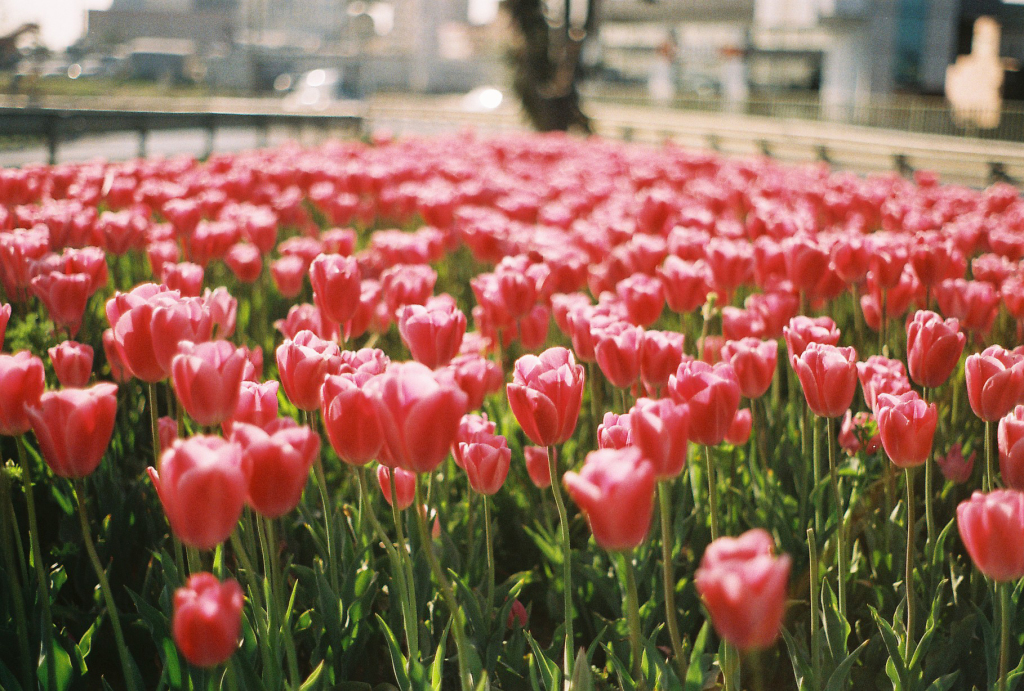
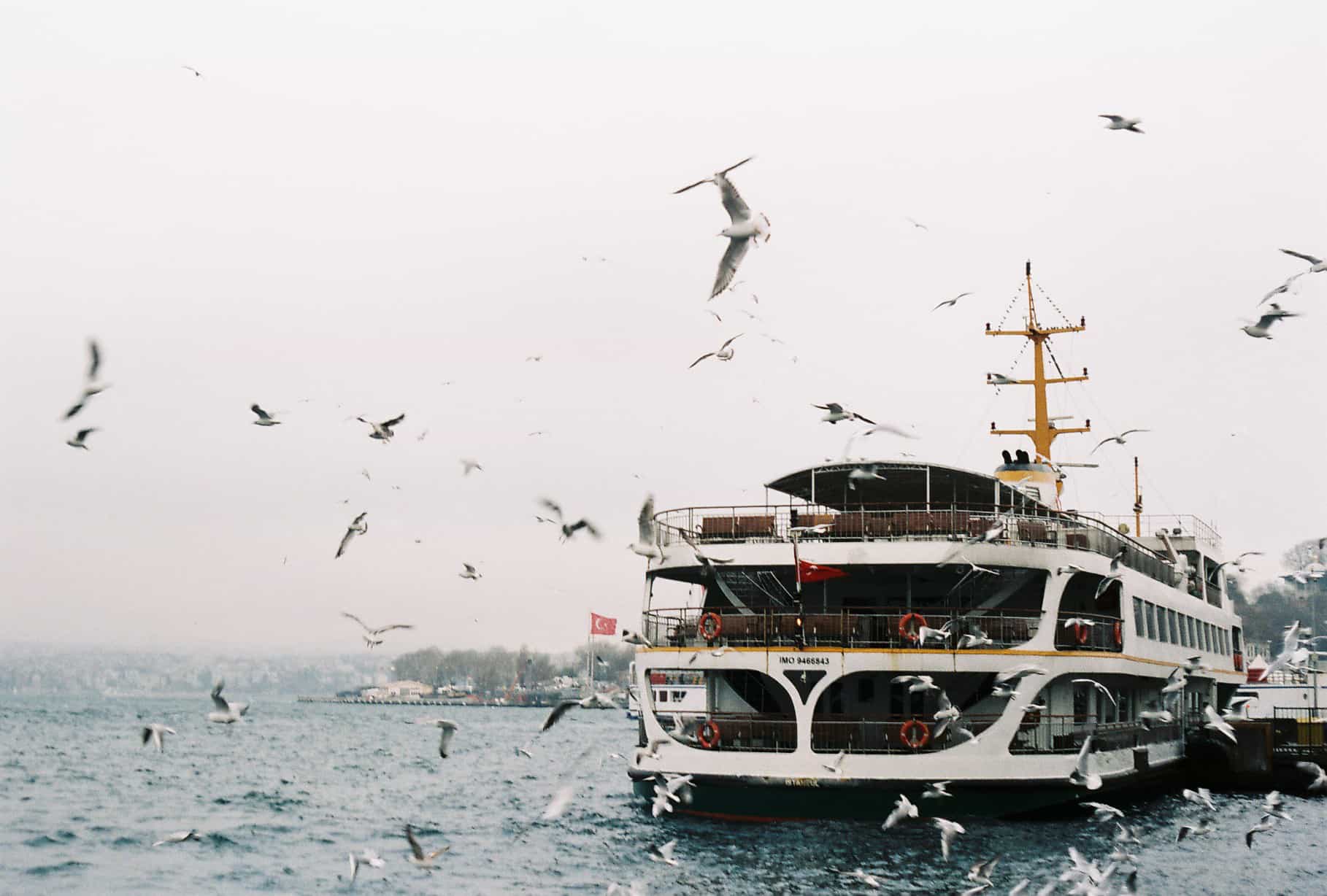
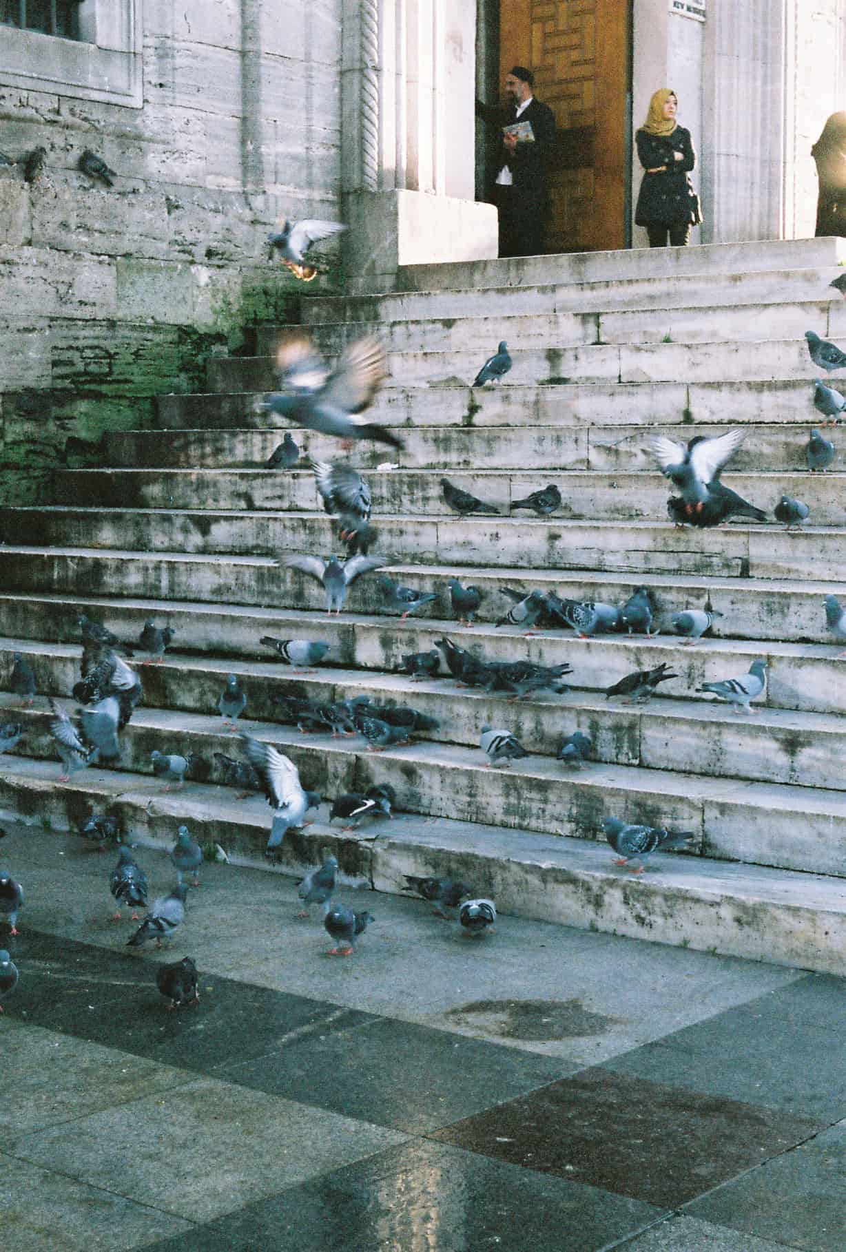
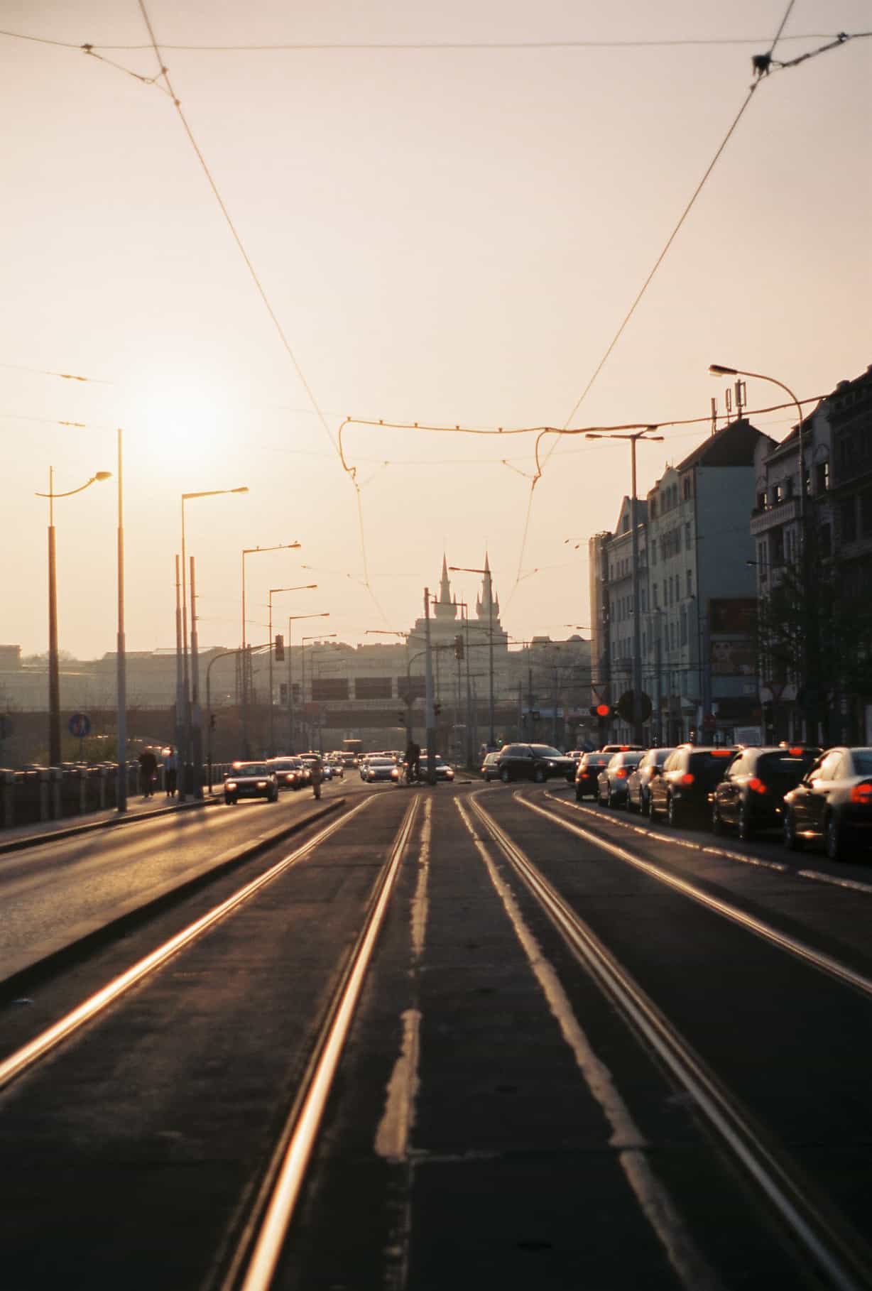
And thank you for sticking around however long you’ve been reading my blog, I truly appreciate it. Now that conference season has ended and the blog has finally been re-designed, I’m looking forward to recommitting to writing more regular content and taking this blog in new and thrilling directions. Here’s to a future full of exciting changes, exhilarating stories, and photographs that make you swoon.


8 Comments
Nikki
November 30, 2014 at 9:19 AMLOVE IT!
Katrinka
December 1, 2014 at 5:48 AMThanks lady 🙂
Polly
November 30, 2014 at 6:20 PMIt looks so good! I really love the homepage, and it looks great on mobile as well!
Katrinka
December 1, 2014 at 5:48 AMThank you Polly! I’m so glad to HAVE a homepage, I’ve wanted to put one in for a while 🙂
Mary Struble Deery
November 30, 2014 at 6:55 PMYeeees! Love it, Katrinka.
Katrinka
December 1, 2014 at 5:49 AMThank you Mary!
Dany Colares
December 1, 2014 at 1:15 PM*SO* pretty. Lovely clean and chic layout. With special attention to images. In other words, totally you! Love it!
Alana - Paper Planes
December 2, 2014 at 6:22 AMI love your photos – congrats on the new design!